Take-home Exercise 2: Regionalisation of Multivariate Water Point Attributes with Non-spatially Constrained and Spatially Constrained Clustering Methods

Author

Hulwana

1 Overview

The process of creating regions is called regionalisation. A regionalisation is a special kind of clustering where the objective is to group observations which are similar in their statistical attributes, but also in their spatial location. In this sense, regionalization embeds the same logic as standard clustering techniques, but also applies a series of geographical constraints. Often, these constraints relate to connectivity: two candidates can only be grouped together in the same region if there exists a path from one member to another member that never leaves the region. These paths often model the spatial relationships in the data, such as contiguity or proximity. However, connectivity does not always need to hold for all regions, and in certain contexts it makes sense to relax connectivity or to impose different types of geographic constraints.

1.1 Getting Started

1.1.1 Load Packages

For our analysis, we will utilize the following packages:

  1. Data Wrangling:
  • sf - for importing and processing geospatial data,

  • tidyverse - for importing and processing non-spatial data. In this exercise, readr package will be used for importing wkt data and dplyr package will be used to wrangling the data,

  1. Visualisation:
  • tmap - for preparation of cartographic quality choropleth map,

  • funModeling - for rapid Exploratory Data Analysis,

  • ggpubr - for creating and customizing ‘ggplot2’- based publication ready plots,

  • corrplot - visual exploratory tool on correlation matrix that supports automatic variable reordering to help detect hidden patterns among variables,

  • heatmaply - for interactive visualisation of cluster heatmaps,

  • GGally - extends ggplot2 by adding several functions to reduce the complexity of combining geoms with transformed data

  1. Correlation and Clustering Analysis:
  • spdep - for computation of spatial weights, global and local spatial autocorrelation statistics,

  • cluster - for cluster analysis,

  • factoextra - to extract and visualise results of multivariate data analyses, and

  • ClustGeo - implements a Ward-like hierarchical clustering algorithm including spatial/geographical constraints

We will run the following code chunk to load the required packages:

pacman::p_load(sf, tidyverse, tmap, spdep, funModeling, ggpubr, corrplot, 
               heatmaply, cluster, factoextra, ClustGeo, GGally)

1.1.2 Import Data

1.1.2.1 Importing water point data

wp_nga <- read_csv("data/aspatial/WPdx.csv") %>%
  filter(`#clean_country_name` == "Nigeria")

Thing to learn from the code chunk above:

  • The original file name is called Water_Point_Data_Exchange_-_PlusWPdx.csv, has been renamed to WPdx.csv for easy encoding.

  • Instead of using read.csv() of Base R to import the csv file into R, read_csv() is readr package is used. This is because during the initial data exploration, we notice that there is at least one field name with space between the field name (ie. New Georeferenced Column)

  • The data file contains water point data of many countries. In this study, we are interested on water point in Nigeria on. Hence, filter() of dplyr is used to extract out records belong to Nigeria only.

1.1.2.2 Convert wkt data

After the data are imported into R environment, it is a good practice to review both the data structure and the data table if it is in tibble data frame format in R Studio.

Notice that the newly imported tibble data frame (i.e. wp_nga) contains a field called New Georeferenced Column which represent spatial data in a textual format. In fact, this kind of text file is popularly known as Well Known Text in short wkt.

Two steps will be used to convert an asptial data file in wkt format into a sf data frame by using sf.

First, st_as_sfc() of sf package is used to derive a new field called Geometry as shown in the code chunk below.

wp_nga$Geometry <- st_as_sfc(wp_nga$`New Georeferenced Column`)

Next, st_sf() will be used to convert the tibble data frame into sf data frame.

The data is currently assigned to the coordinates system of WGS 84 but we require using the CRS of Nigeria with an ESPG code of either 26391, 26392, and 26303. Therefore, we will use the st_transform() function to mapped to the EPSG code of 26391 for our analysis.

wp_nga <- st_sf(wp_nga, crs=4326) %>% st_transform(crs = 26391)
wp_nga

1.1.2.3 Importing Nigeria LGA level boundary data

Now, we are going to import the LGA (Local Government Area) boundary data obtained from Humanitarian Data Exchange portal into R environment by using the code chunk below.

nga <- st_read(dsn = "data/geospatial",
               layer = "nga_admbnda_adm2_osgof_20190417",
               crs = 4326) %>%
  st_transform(crs = 26391) %>%
  select(3:4,8:9,17)
Reading layer `nga_admbnda_adm2_osgof_20190417' from data source 
  `C:\hulwana\ISSS624\Take-Home_Ex\Take-Home_Ex2\data\geospatial' 
  using driver `ESRI Shapefile'
Simple feature collection with 774 features and 16 fields
Geometry type: MULTIPOLYGON
Dimension:     XY
Bounding box:  xmin: 2.668534 ymin: 4.273007 xmax: 14.67882 ymax: 13.89442
Geodetic CRS:  WGS 84

1.2 Data Preparation

Before proceeding to the geospatial analysis, we will first prepare the data.

1.2.1 Checking duplicated area names

We will first check if there are any duplicated areas by running the following code chunk:

dup <- nga$ADM2_EN[duplicated(nga$ADM2_EN)]
dup
[1] "Bassa"    "Ifelodun" "Irepodun" "Nasarawa" "Obi"      "Surulere"

From the above, we see that areas Bassa, Ifelodun, Irepodun, Nasarawa, Obi and Surulere have duplicated labeling.

We will then plot the duplicated areas to determine and understand where are the areas with duplicated names.

dup_areas <- nga %>%
  filter(ADM2_EN %in% dup) %>%
  select(ADM2_EN, geometry)

state_borders <- nga %>%
  select(ADM1_EN, geometry)

tmap_mode("view")

tm_shape(state_borders) +
  tm_fill("ADM1_EN") +
tm_shape(dup_areas) +
   tm_polygons("ADM2_EN", alpha = 0.08) +
  tm_layout(legend.show = FALSE)
tmap_mode("plot")

Based on the information gathered in nigeriainfopedia, we realized that the duplication in names exist due to areas having similar names but located in different state. The states at which these areas are located are as follows:

dup_areas_state <- nga %>%
  filter(ADM2_EN %in% dup) %>%
  select(ADM2_EN, ADM1_EN)

dup_areas_state
Simple feature collection with 12 features and 2 fields
Geometry type: MULTIPOLYGON
Dimension:     XY
Bounding box:  xmin: 99926.41 ymin: 271934.4 xmax: 729231.7 ymax: 893313
Projected CRS: Minna / Nigeria West Belt
First 10 features:
    ADM2_EN  ADM1_EN                       geometry
1     Bassa     Kogi MULTIPOLYGON (((555599.8 44...
2     Bassa  Plateau MULTIPOLYGON (((704592.8 70...
3  Ifelodun    Kwara MULTIPOLYGON (((273735.2 55...
4  Ifelodun     Osun MULTIPOLYGON (((255291.7 43...
5  Irepodun    Kwara MULTIPOLYGON (((305947.5 46...
6  Irepodun     Osun MULTIPOLYGON (((235603 4279...
7  Nasarawa     Kano MULTIPOLYGON (((677128.6 89...
8  Nasarawa Nasarawa MULTIPOLYGON (((608258.1 51...
9       Obi    Benue MULTIPOLYGON (((663064.8 34...
10      Obi Nasarawa MULTIPOLYGON (((727739.2 48...

Since these areas have duplicated names, it might result in an inaccurate analysis when they are aggregated together. Therefore the duplicated names have to be recoded by executing the following code chunk:

nga$ADM2_EN[nga$ADM2_EN == "Bassa" & nga$ADM1_EN == "Kogi"] <- "Bassa (Kogi)"
nga$ADM2_EN[nga$ADM2_EN == "Bassa" & nga$ADM1_EN == "Plateau"] <- "Bassa (Plateau)"
nga$ADM2_EN[nga$ADM2_EN == "Ifelodun" & nga$ADM1_EN == "Kwara"] <- "Ifelodun (Kwara)"
nga$ADM2_EN[nga$ADM2_EN == "Ifelodun" & nga$ADM1_EN == "Osun"] <- "Ifelodun (Osun)"
nga$ADM2_EN[nga$ADM2_EN == "Irepodun" & nga$ADM1_EN == "Kwara"] <- "Irepodun (Kwara)"
nga$ADM2_EN[nga$ADM2_EN == "Irepodun" & nga$ADM1_EN == "Osun"] <- "Irepodun (Osun)"
nga$ADM2_EN[nga$ADM2_EN == "Nasarawa" & nga$ADM1_EN == "Kano"] <- "Nasarawa (Kano)"
nga$ADM2_EN[nga$ADM2_EN == "Nasarawa" & nga$ADM1_EN == "Nasarawa"] <- "Nasarawa (Nasarawa)"
nga$ADM2_EN[nga$ADM2_EN == "Obi" & nga$ADM1_EN == "Benue"] <- "Obi (Benue)"
nga$ADM2_EN[nga$ADM2_EN == "Obi" & nga$ADM1_EN == "Nasarawa"] <- "Obi (Nasarawa)"
nga$ADM2_EN[nga$ADM2_EN == "Surulere" & nga$ADM1_EN == "Lagos"] <- "Surulere (Lagos)"
nga$ADM2_EN[nga$ADM2_EN == "Surulere" & nga$ADM1_EN == "Oyo"] <- "Surulere (Oyo)"

Check if there are duplicated in LGA names after the clean-up

nga$ADM2_EN[duplicated(nga$ADM2_EN)]
character(0)

1.3 Data Wrangling

1.3.1 Extract all the required variables and recode if needed

Since we would like to understand if there are any similar characteristics of areas in Nigeria with respect to the availability of water points, we will need to extract the required variables and prepare them. We will first load the data to see what are the fields present by using the glimpse() function.

glimpse(wp_nga)

In total there are 71 fields each having 95,008 observations.

The data required for our analysis are:

  • Total number of functional water points

  • Total number of nonfunctional water points

  • Percentage of functional water points

  • Percentage of non-functional water points

  • Percentage of main water point technology (i.e. Hand Pump)

  • Percentage of usage capacity (i.e. < 1000, >=1000)

  • Percentage of rural water points

Thus we will:

  1. Select the columns #water_tech_category, #status_clean and is_urban

  2. Additional columns selected for consideration: #subjective_quality and usage_capacity

  3. Tidy the name of variables that starts with “#”

wp_rev <- wp_nga %>%
  select(10,22,26,46,47) %>%
  rename(`water_tech` = `#water_tech_category`, `status_clean` = `#status_clean`,
         `quality` = `#subjective_quality` )

The freq() function from funModeling package, allows quick visualisation on the count and percentages of each type of categories., as shown below;

freq(data=wp_rev, 
     input = 'status_clean')
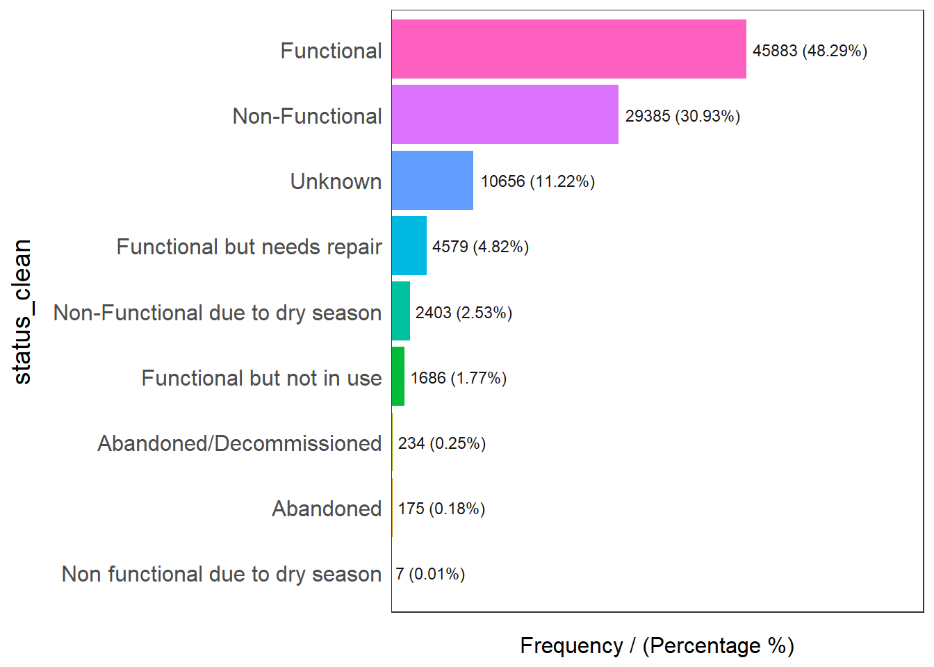
                      status_clean frequency percentage cumulative_perc
1                       Functional     45883      48.29           48.29
2                   Non-Functional     29385      30.93           79.22
3                          Unknown     10656      11.22           90.44
4      Functional but needs repair      4579       4.82           95.26
5 Non-Functional due to dry season      2403       2.53           97.79
6        Functional but not in use      1686       1.77           99.56
7         Abandoned/Decommissioned       234       0.25           99.81
8                        Abandoned       175       0.18           99.99
9 Non functional due to dry season         7       0.01          100.00

1.3.1.1 Recoding NA values into String

We observed that there are more than 10% of observations that are NAs for this field. Thus, we will recode it into ‘Unknown’.

wp_rev <- wp_rev %>%
   dplyr::mutate(status_clean = 
           replace_na(status_clean, "Unknown"))

1.3.2 Extracting Water Point Data

Since, we are interested to know how many functional and non-functional taps there are, we execute the following codes to count the number of functional and non-functional taps as well as calculate the percentages of each type of taps.

For the status_clean variable, we will also re-group the water points into the following categories:

  • Unknown

  • Functional

  • Non-functional

1.3.2.1 Extracting Water Point with Unknown Class

In the code chunk below, filter() of dplyr is used to select water points with unknown status.

wpt_unknown <- wp_rev %>%
  filter(status_clean == "Unknown")

1.3.2.2 Extracting Functional Water Point

In the code chunk below, filter() of dplyr is used to select functional water points.

We will consider the following categories as functional water points:

  • Functional

  • Functional but not in use

  • Functional but needs repair

wpt_functional <- wp_rev %>%
  filter(status_clean %in%
           c("Functional", 
             "Functional but not in use",
             "Functional but needs repair"))

1.3.2.3 Extracting Non-Functional Water Point

On the other hand, the following categories, will be grouped as non-functional water points:

  • Non-Functional

  • Non-Functional due to dry season

  • Abandoned/Decommissioned

  • Abandoned

  • Non functional due to dry season

wpt_nonfunctional <- wp_rev %>%
  filter(status_clean %in%
           c("Non-Functional",
             "Non-Functional due to dry season",
             "Abandoned/Decommissioned",
             "Abandoned",
             "Non functional due to dry season"))

1.3.2.4 Performing Point-in-Polygon Count

To count the number of different categories of water points found by LGA, we will utilize the mutate() function for the calculation as shown in the code:

nga_wp <- nga %>% 
  mutate(`total wpt` = lengths(
    st_intersects(nga, wp_rev))) %>%
  mutate(`wpt functional` = lengths(
    st_intersects(nga, wpt_functional))) %>%
  mutate(`wpt non-functional` = lengths(
    st_intersects(nga, wpt_nonfunctional))) %>%
  mutate(`wpt unknown` = lengths(
    st_intersects(nga, wpt_unknown)))

1.3.2.5 Compute the Percentages of Water Points

To compute the percentages of functional and non-functional water points, we execute the following code:

nga_wp <- nga_wp %>%
  mutate(pct_functional = `wpt functional`/`total wpt`) %>%
  mutate(`pct_non-functional` = `wpt non-functional`/`total wpt`)

1.3.3 Extracting Water Technology Data

To see what are the different types of water technology present as well as its distribution, we run the following code:

freq(data=wp_rev, 
     input = 'water_tech')
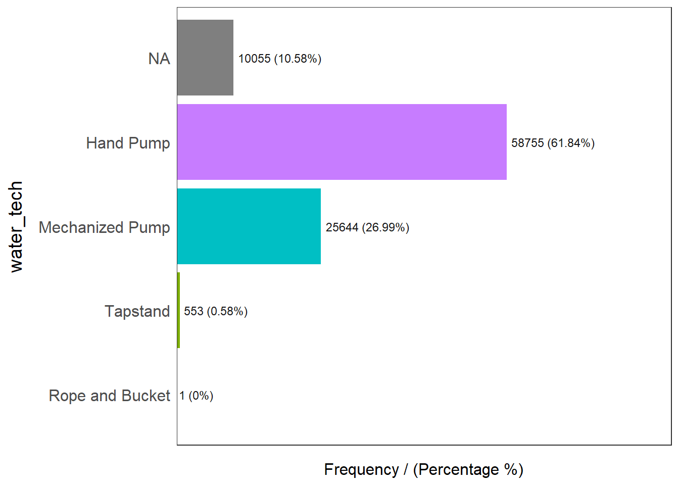
       water_tech frequency percentage cumulative_perc
1       Hand Pump     58755      61.84           61.84
2 Mechanized Pump     25644      26.99           88.83
3            <NA>     10055      10.58           99.41
4        Tapstand       553       0.58           99.99
5 Rope and Bucket         1       0.00          100.00

Observed that the dominating type of water technology belongs to the ‘Hand Pump’ category at 61.84% of the water points found in Nigeria. As the number of ‘Mechanized Pump’ is substantially large we will also consider the percentage of this type of water point technology in our analysis. The number of water points that are either ‘Tapstand’ and ‘Rope and Bucket’ is too small and thus will not be considered in our analysis.

1.3.3.1 Extracting Hand Pump Water Points

wpt_hand <- wp_rev %>%
  filter(water_tech == "Hand Pump")

1.3.3.2 Extracting Mechanized Pump Water Points

wpt_mechanized <- wp_rev %>%
  filter(water_tech == "Mechanized Pump")

1.3.3.3 Performing Point-in-Polygon Count

To count the number of different categories of water point technologies found in each LGA, we will utilize the mutate() function for the calculation as shown in the code:

nga_wp <- nga_wp %>% 
  mutate(`wpt hand` = lengths(
    st_intersects(nga_wp, wpt_hand))) %>%
  mutate(`wpt mechanized` = lengths(
    st_intersects(nga_wp, wpt_mechanized)))

1.3.3.4 Compute the Percentages of Hand Pump and Mechanized Pump Water Points

To compute the percentages of hand pump and mechanized pump water points, we execute the following code:

nga_wp <- nga_wp %>%
  mutate(pct_hand = `wpt hand`/`total wpt`) %>%
  mutate(`pct_mechanized` = `wpt mechanized`/`total wpt`)

1.3.4 Extracting Rural and Urban Areas

To obtain the percentages of rural areas, we extract the data from the is_urban field.

1.3.4.1 Extract data on rural areas

wpt_rural <- wp_rev %>%
  filter(is_urban == FALSE)

1.3.4.2 Performing Point-in-Polygon Count

To count the number of rural areas found in each LGA, we will utilize the mutate() function for the calculation as shown in the code:

nga_wp <- nga_wp %>% 
  mutate(`wpt rural` = lengths(
    st_intersects(nga_wp, wpt_rural)))

1.3.4.3 Compute the Percentages of Rural Areas

To compute the percentages of rural areas, we execute the following code:

nga_wp <- nga_wp %>%
  mutate(pct_rural = `wpt rural`/`total wpt`)

1.3.5 Extracting Quality

1.3.5.1 Different Categories for Quality

To plot a bar chart on the different categories under the variable quality, we can run the following code:

freq(data=wp_rev, 
     input = 'quality')
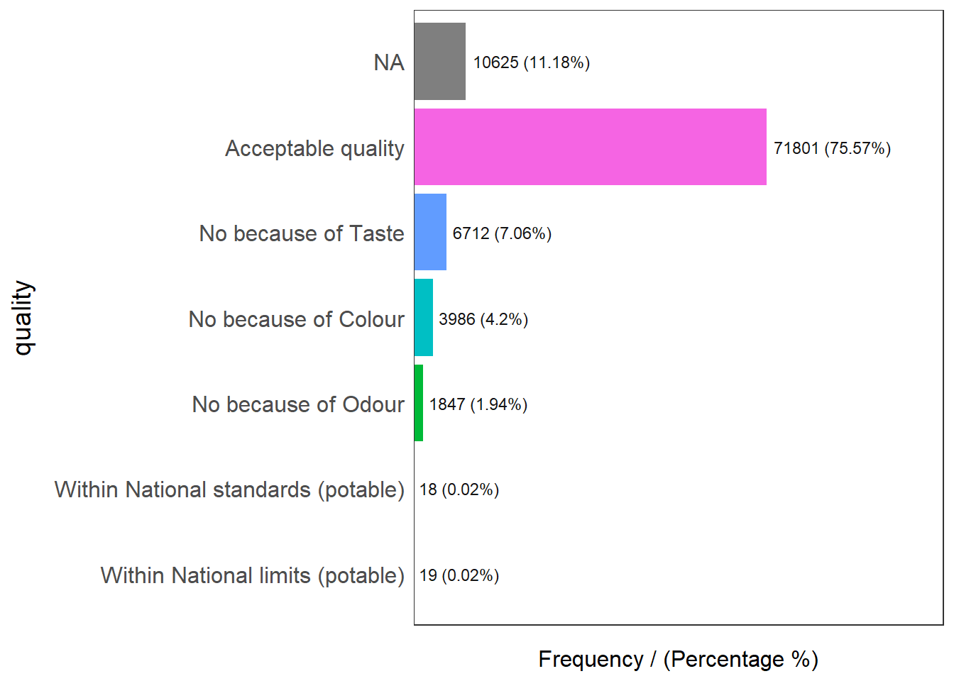
                              quality frequency percentage cumulative_perc
1                  Acceptable quality     71801      75.57           75.57
2                                <NA>     10625      11.18           86.75
3                 No because of Taste      6712       7.06           93.81
4                No because of Colour      3986       4.20           98.01
5                 No because of Odour      1847       1.94           99.95
6    Within National limits (potable)        19       0.02           99.97
7 Within National standards (potable)        18       0.02          100.00

1.3.5.2 Acceptable Quality

The categories “Acceptable quality”, “Within National standards (potable)” and “Within National limits (potable)” will be classified as acceptable water quality.

wpt_acceptable <- wp_rev %>%
  filter(quality %in%
           c("Acceptable quality", 
             "Within National standards (potable)",
             "Within National limits (potable)"))

1.3.5.3 Unacceptable Quality

Whereas the categories “No because of Taste”, “No because of Colour”, and “No because of Odour” will be classified as unacceptable quality of water.

wpt_unacceptable <- wp_rev %>%
  filter(quality %in%
           c("No because of Taste", 
             "No because of Colour",
             "No because of Odour"))

1.3.5.4 Performing Point-in-Polygon Count

nga_wp <- nga_wp %>% 
  mutate(`wpt acceptable` = lengths(
    st_intersects(nga_wp, wpt_acceptable))) %>%
  mutate(`wpt unacceptable` = lengths(
    st_intersects(nga_wp, wpt_unacceptable)))

1.3.5.5 Compute the Percentages of Acceptable and Unacceptable Water Quality

nga_wp <- nga_wp %>%
  mutate(pct_acceptable = `wpt acceptable`/`total wpt`) %>%
  mutate(pct_unacceptable = `wpt unacceptable`/`total wpt`)

1.3.6 Usage Capacity

1.3.6.1 Extracting Usage Capacity Data

freq(data=wp_rev, 
     input = 'usage_capacity')
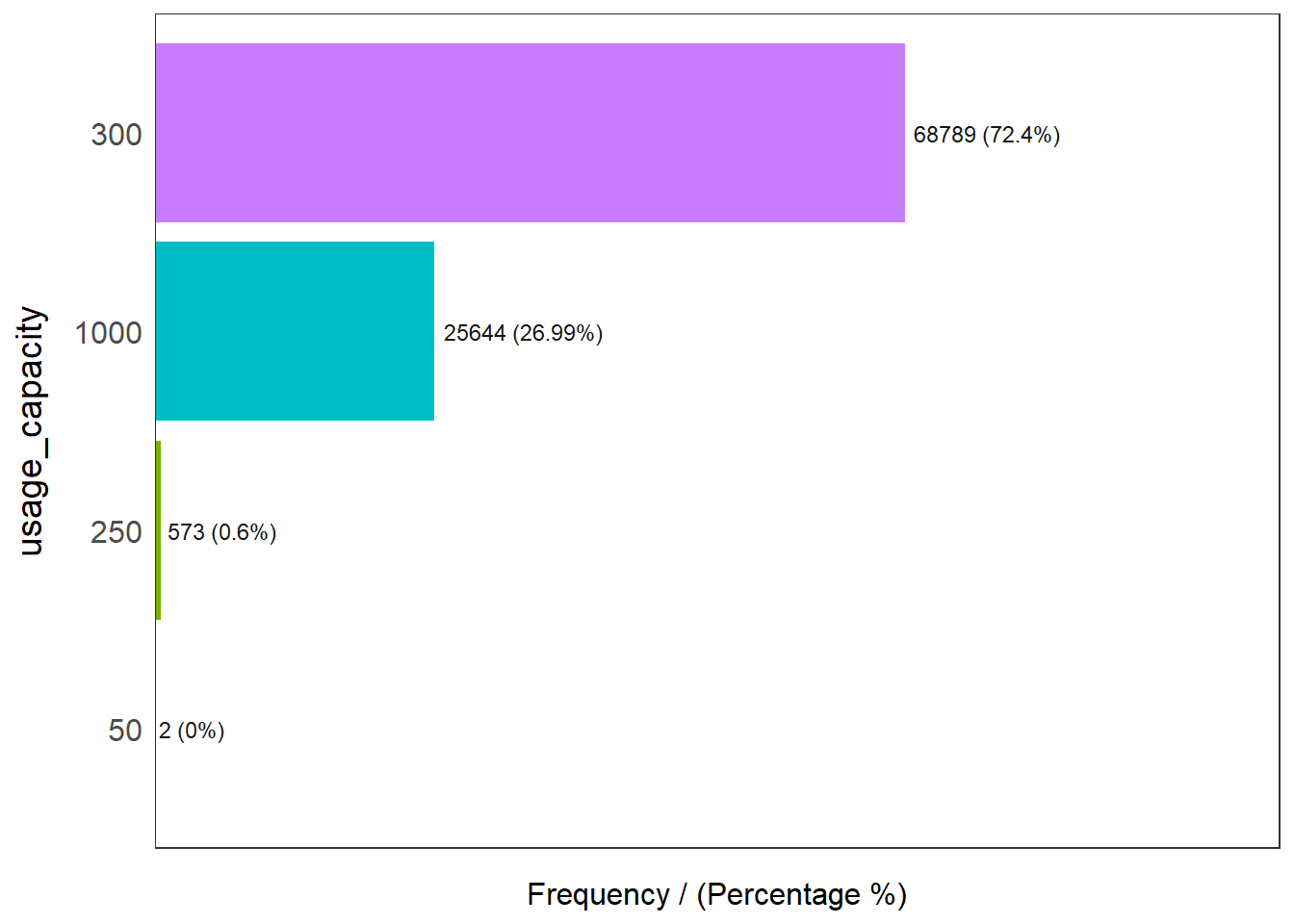
  usage_capacity frequency percentage cumulative_perc
1            300     68789      72.40           72.40
2           1000     25644      26.99           99.39
3            250       573       0.60           99.99
4             50         2       0.00          100.00

We see that there are 2 groups with substantial number of observations which are 300 and 1000. Thus, we will recode the groups to those with less than or equal to 300 and more than 300.

1.3.6.2 Usage capacity of 300 or lesser

wpt_less300 <- wp_rev %>%
  filter(usage_capacity < 301)

1.3.6.3 Usage capacity greater than 300

wpt_more300 <- wp_rev %>%
  filter(usage_capacity > 300)

1.3.6.4 Performing Point-in-Polygon Count

nga_wp <- nga_wp %>% 
  mutate(`wpt less300` = lengths(
    st_intersects(nga_wp, wpt_less300))) %>%
  mutate(`wpt more300` = lengths(
    st_intersects(nga_wp, wpt_more300)))

1.3.6.5 Compute the Percentages of Usage Capacity less than or greater than 301

nga_wp <- nga_wp %>%
  mutate(pct_less300 = `wpt less300`/`total wpt`) %>%
  mutate(pct_more300 = `wpt more300`/`total wpt`)

1.3.7 Saving Data

We will then save the cleaned data in rds format.

write_rds(wp_rev, "data/wp_rev.rds")
write_rds(nga, "data/nga.rds")
write_rds(nga_wp, "data/nga_wp.rds")

2 Exploratory Data Analysis

2.1 Summary Statistics

Let us review the summary statistics of the newly derived penetration rates using the code chunk below.

summary(nga_wp)
   ADM2_EN           ADM2_PCODE          ADM1_EN           ADM1_PCODE       
 Length:774         Length:774         Length:774         Length:774        
 Class :character   Class :character   Class :character   Class :character  
 Mode  :character   Mode  :character   Mode  :character   Mode  :character  


          geometry     total wpt     wpt functional   wpt non-functional
 MULTIPOLYGON :774   Min.   :  0.0   Min.   :  0.00   Min.   :  0.00    
 epsg:26391   :  0   1st Qu.: 45.0   1st Qu.: 17.00   1st Qu.: 12.25    
 +proj=tmer...:  0   Median : 96.0   Median : 45.50   Median : 34.00    
                     Mean   :122.7   Mean   : 67.36   Mean   : 41.60    
                     3rd Qu.:168.8   3rd Qu.: 87.75   3rd Qu.: 60.75    
                     Max.   :894.0   Max.   :752.00   Max.   :278.00    
                                                                        
  wpt unknown     pct_functional   pct_non-functional    wpt hand     
 Min.   :  0.00   Min.   :0.0000   Min.   :0.0000     Min.   :  0.00  
 1st Qu.:  0.00   1st Qu.:0.3333   1st Qu.:0.2211     1st Qu.:  6.00  
 Median :  0.00   Median :0.4792   Median :0.3559     Median : 47.00  
 Mean   : 13.76   Mean   :0.5070   Mean   :0.3654     Mean   : 75.89  
 3rd Qu.: 17.75   3rd Qu.:0.6749   3rd Qu.:0.5082     3rd Qu.:111.00  
 Max.   :219.00   Max.   :1.0000   Max.   :1.0000     Max.   :764.00  
                  NA's   :13       NA's   :13                         
 wpt mechanized      pct_hand      pct_mechanized     wpt rural     
 Min.   :  0.00   Min.   :0.0000   Min.   :0.0000   Min.   :  0.00  
 1st Qu.: 11.00   1st Qu.:0.1860   1st Qu.:0.1250   1st Qu.: 23.00  
 Median : 25.50   Median :0.5255   Median :0.3193   Median : 64.00  
 Mean   : 33.12   Mean   :0.4956   Mean   :0.3818   Mean   : 97.45  
 3rd Qu.: 46.00   3rd Qu.:0.7857   3rd Qu.:0.5843   3rd Qu.:141.00  
 Max.   :245.00   Max.   :1.0000   Max.   :1.0000   Max.   :894.00  
                  NA's   :13       NA's   :13                       
   pct_rural      wpt acceptable   wpt unacceptable pct_acceptable  
 Min.   :0.0000   Min.   :  0.00   Min.   :  0.0    Min.   :0.0000  
 1st Qu.:0.5922   1st Qu.: 28.00   1st Qu.:  3.0    1st Qu.:0.5595  
 Median :0.8717   Median : 71.00   Median :  9.0    Median :0.7759  
 Mean   :0.7395   Mean   : 92.79   Mean   : 16.2    Mean   :0.7172  
 3rd Qu.:1.0000   3rd Qu.:127.00   3rd Qu.: 21.0    3rd Qu.:0.9221  
 Max.   :1.0000   Max.   :833.00   Max.   :225.0    Max.   :1.0000  
 NA's   :13                                         NA's   :13      
 pct_unacceptable   wpt less300      wpt more300      pct_less300    
 Min.   :0.00000   Min.   :  0.00   Min.   :  0.00   Min.   :0.0000  
 1st Qu.:0.04124   1st Qu.: 16.00   1st Qu.: 11.00   1st Qu.:0.4157  
 Median :0.10526   Median : 60.00   Median : 25.50   Median :0.6807  
 Mean   :0.15565   Mean   : 89.59   Mean   : 33.12   Mean   :0.6182  
 3rd Qu.:0.21429   3rd Qu.:127.75   3rd Qu.: 46.00   3rd Qu.:0.8750  
 Max.   :1.00000   Max.   :767.00   Max.   :245.00   Max.   :1.0000  
 NA's   :13                                          NA's   :13      
  pct_more300    
 Min.   :0.0000  
 1st Qu.:0.1250  
 Median :0.3193  
 Mean   :0.3818  
 3rd Qu.:0.5843  
 Max.   :1.0000  
 NA's   :13      

2.2 EDA using Histogram

Here, we take a look at the distribution of the percentages variable

functional <- ggplot(data=nga_wp, 
             aes(x= `pct_functional`)) +
  geom_histogram(bins=20, 
                 color="black", 
                 fill="light blue")

nonfunctional <- ggplot(data=nga_wp, 
             aes(x= `pct_non-functional`)) +
  geom_histogram(bins=20, 
                 color="black", 
                 fill="light blue")

hand <- ggplot(data=nga_wp, 
             aes(x= `pct_hand`)) +
  geom_histogram(bins=20, 
                 color="black", 
                 fill="light blue")

mechanized <- ggplot(data=nga_wp, 
             aes(x= `pct_mechanized`)) +
  geom_histogram(bins=20, 
                 color="black", 
                 fill="light blue")

rural <- ggplot(data=nga_wp, 
             aes(x= `pct_rural`)) +
  geom_histogram(bins=20, 
                 color="black", 
                 fill="light blue")

acceptable <- ggplot(data=nga_wp, 
             aes(x= `pct_acceptable`)) +
  geom_histogram(bins=20, 
                 color="black", 
                 fill="light blue")

unacceptable <- ggplot(data=nga_wp, 
             aes(x= `pct_unacceptable`)) +
  geom_histogram(bins=20, 
                 color="black", 
                 fill="light blue")

less300 <- ggplot(data=nga_wp, 
             aes(x= `pct_less300`)) +
  geom_histogram(bins=20, 
                 color="black", 
                 fill="light blue")

more300 <- ggplot(data=nga_wp, 
             aes(x= `pct_more300`)) +
  geom_histogram(bins=20, 
                 color="black", 
                 fill="light blue")

ggarrange(functional, nonfunctional, hand, mechanized, acceptable, unacceptable,
          less300, more300, rural,
          ncol = 3, 
          nrow = 3)
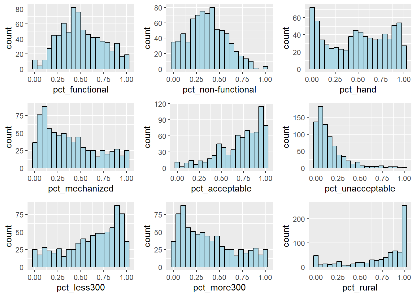
Notice that the variables pct_acceptable, pct_less300 and pct_rural are skewed to the left. Whereas, variables pct_mechanized, pct_unacceptable and pct_more300 are skewed to the right.

2.3 EDA using Choropleth Map

2.3.1 Total Water Points

qtm(nga_wp, "total wpt")
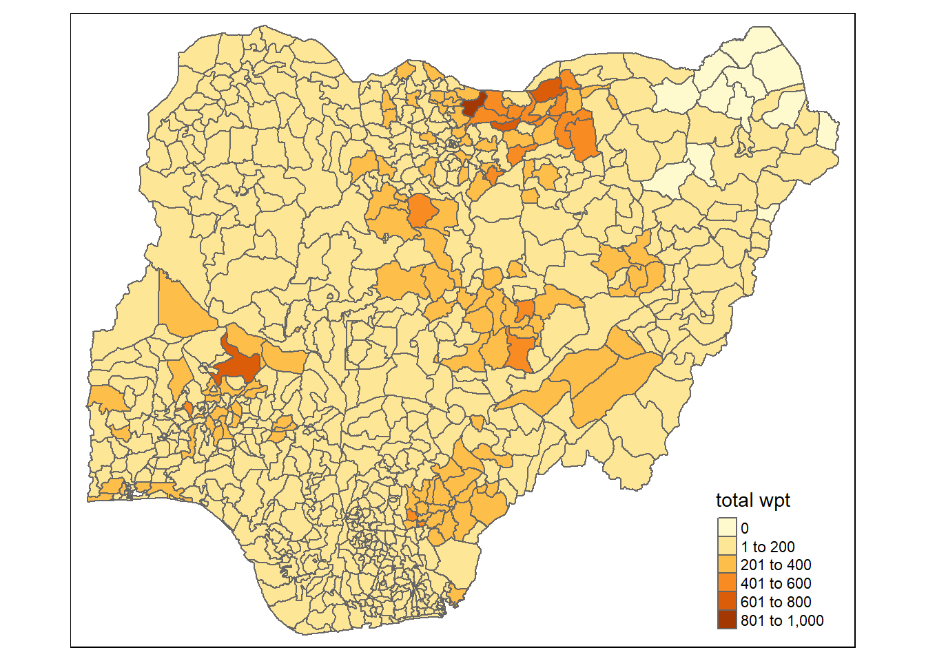
From the above map, we notice that there are a number of areas in the north-eastern part of Nigeria in which there 0 data on the number of water points.

2.3.2 Distribution of Functional and Non-functional Water Points by Percentages

tmap_mode("view")

pct_functional <- tm_shape(nga_wp) + 
  tm_fill("pct_functional") + 
  tm_borders() 

pct_nonfunctional <- tm_shape(nga_wp) + 
  tm_fill("pct_non-functional") + 
  tm_borders() 

tmap_arrange(pct_functional, pct_nonfunctional,
             asp = 1, ncol = 2,
             sync = TRUE)
tmap_mode("plot")

In terms of functional water points, areas in the northern region have high percentages in comparison to other parts in Nigeria, while in terms of non-functional water points, areas in southern part of Nigeria tended to have higher percentages.

2.3.3 Distribution of Hand Pump and Mechanized Pump by Percentages

tmap_mode("view")

pct_hand <- tm_shape(nga_wp) + 
  tm_fill("pct_hand", palette = "BuGn") + 
  tm_borders() 

pct_mechanized <- tm_shape(nga_wp) + 
  tm_fill("pct_mechanized", palette = "BuGn") + 
  tm_borders() 

tmap_arrange(pct_hand, pct_mechanized,
             asp = 1, ncol = 2,
             sync = TRUE)
tmap_mode("plot")

We see a similar trend to that of the distribution of functional and non-functional water points, where the norther regions of Nigeria tend to have higher percentages of hand pump but lower percentage of mechanized pump whereas southern regions of Nigeria tended to have higher percentages of mechanized pumps but lower percentages of hand pumps. Perhaps this could be attributed to the technology and development of the different regions and therefore we should proceed to look if there is a similar trend in terms of rural areas.

2.3.4 Distribution of Rural Areas by Percentages

tmap_mode("view")

tm_shape(nga_wp) + 
  tm_fill("pct_rural", palette = "YlGn") + 
  tm_borders(col = "black", lwd = 2)
tmap_mode("plot")

Surprisingly, in terms of percentage of rural areas, it is almost homogeneous throughout Nigeria.

2.3.5 Distribution of Water Quality by Percentages

tmap_mode("view")

pct_accept <- tm_shape(nga_wp) + 
  tm_fill("pct_acceptable", palette = "Blues") + 
  tm_borders()

pct_unaccept <- tm_shape(nga_wp) + 
  tm_fill("pct_unacceptable", palette = "Blues") + 
  tm_borders()

tmap_arrange(pct_accept, pct_unaccept,
             asp = 1, ncol = 2,
             sync = TRUE)
tmap_mode("plot")

Based on the percentages of acceptable water quality, we see that the the distribution is also quite homogeneous among the areas in Nigeria with majority having high percentage of acceptable water quality.

2.3.6 Distribution of Usage Capacity by Percentages

tmap_mode("view")

pct_less300 <- tm_shape(nga_wp) + 
  tm_fill("pct_less300", palette = "BuPu") + 
  tm_borders()

pct_more300 <- tm_shape(nga_wp) + 
  tm_fill("pct_more300", palette = "BuPu") + 
  tm_borders()

tmap_arrange(pct_less300, pct_more300,
             asp = 1, ncol = 2,
             sync = TRUE)
tmap_mode("plot")

We observe that high percentages of usage capacity that greater than 300 is prevalent in the southern part of Nigeria and some areas towards the extreme north-western region of Nigeria.

2.3.7 Further Data Preparation

From the above EDA, we notice that there are a number of areas in the north eastern part which seems to have missing water point data. To tackle this issue, we have 2 possible approaches by either:

  1. excluding those with unknown or missing data points from the analysis or

  2. to impute an estimated value.

For our case, as the observations with NAs stems from no water point data for most of the fields (functional water points, usage capacity, etc.) we will omit these observations so as to obtain a more accurate analysis.

nga_wp <- nga_wp %>%
  filter(`total wpt` > 0)

2.4 Multicollinearity

2.4.1 Correlation Analysis

Before we perform cluster analysis, it is important for us to ensure that the cluster variables are not highly correlated. Highly correlated variables might lead to biased results in which more weight are given to factors that are strongly correlated.

We use the corrplot.mixed() function of corrplot package to visualise and analyse the correlation of the input variables.

nga_wp2 <- nga_wp %>%
  select(7,8,10,11,14,15,17,20,21,24,25) %>%
  st_drop_geometry()

cluster_vars.cor = cor(nga_wp2)
corrplot.mixed(cluster_vars.cor,
               lower = "ellipse", 
               upper = "number",
               tl.pos = "lt",
               diag = "l",
               tl.col = "black", 
               number.cex = 0.6)

Based on the correlation value computed, the following variables have high correlation of 0.8 and above:

  • pct_hand and pct_mechanized

  • pct_hand and pct_less300

  • pct_hand and pct_more300

  • pct_mechanized and pct_less300 ( a correlation value of -1)

  • pct_mechanized and pct_more300 ( a correlation value of 1)

  • pct_less300 and pct_more300 ( a correlation value of -1)

Since these variables are highly correlated to each other (some to the extend of having a perfect correlation!), we should remove one from each pair of correlated variables. In our case, we will exclude the variables pct_mechanized, pct_less300 and pct_more300.

3 Clustering Analysis

In this section, we will perform hierarchical clustering.

3.1 Additional Data Preparation

Before we even proceed with the clustering, we need to further prepare the data.

3.1.1 Extracting clustering variables

The code chunk below will be used to extract the clustering variables from the nga_wp simple feature object into data.frame.

As hierarchical clustering does not consider geospatial data, thus it will be excluded by the code st_drop_geometry().

nga_clust <- nga_wp %>%
  select(1,7,8,10,11,14,17,20,21) %>%
  st_drop_geometry()

Notice that the final clustering variables list does not include variable pct_mechanized, pct_less300 and pct_more300 because it is highly correlated with the variable pct_hand.

Next, we need to change the rows by LGA instead of row number by using the code chunk below:

row.names(nga_clust) <- nga_clust$"ADM2_EN"
head(nga_clust,10)
                      ADM2_EN wpt functional wpt non-functional pct_functional
Aba North           Aba North              7                  9      0.4117647
Aba South           Aba South             29                 35      0.4084507
Abaji                   Abaji             23                 34      0.4035088
Abak                     Abak             23                 25      0.4791667
Abakaliki           Abakaliki             82                 42      0.3519313
Abeokuta North Abeokuta North             16                 15      0.4705882
Abeokuta South Abeokuta South             72                 33      0.6050420
Abi                       Abi             79                 62      0.5197368
Aboh-Mbaise       Aboh-Mbaise             18                 26      0.2727273
Abua/Odual         Abua/Odual             25                 13      0.6410256
               pct_non-functional   pct_hand  pct_rural pct_acceptable
Aba North               0.5294118 0.11764706 0.00000000      0.7647059
Aba South               0.4929577 0.09859155 0.05633803      0.8028169
Abaji                   0.5964912 0.40350877 0.84210526      0.9824561
Abak                    0.5208333 0.08333333 0.83333333      0.7291667
Abakaliki               0.1802575 0.43776824 0.87553648      0.4206009
Abeokuta North          0.4411765 0.14705882 0.20588235      0.7352941
Abeokuta South          0.2773109 0.16806723 0.00000000      0.8655462
Abi                     0.4078947 0.59868421 0.95394737      0.5657895
Aboh-Mbaise             0.3939394 0.01515152 0.72727273      0.5303030
Abua/Odual              0.3333333 0.30769231 0.53846154      0.8717949
               pct_unacceptable
Aba North            0.17647059
Aba South            0.09859155
Abaji                0.01754386
Abak                 0.27083333
Abakaliki            0.11158798
Abeokuta North       0.17647059
Abeokuta South       0.01680672
Abi                  0.36184211
Aboh-Mbaise          0.13636364
Abua/Odual           0.10256410

Notice that the row number has been replaced into the LGA name. This is because hierarchical clustering does not need the LGA name. However, since we need to reference back to the LGA when we deduce the insights, thus we retain it as the rownames/ object id.

Now, we will exclude the ADM2_EN field by using the code chunk below.

nga_clust <- select(nga_clust, c(2:9))
head(nga_clust, 10)
               wpt functional wpt non-functional pct_functional
Aba North                   7                  9      0.4117647
Aba South                  29                 35      0.4084507
Abaji                      23                 34      0.4035088
Abak                       23                 25      0.4791667
Abakaliki                  82                 42      0.3519313
Abeokuta North             16                 15      0.4705882
Abeokuta South             72                 33      0.6050420
Abi                        79                 62      0.5197368
Aboh-Mbaise                18                 26      0.2727273
Abua/Odual                 25                 13      0.6410256
               pct_non-functional   pct_hand  pct_rural pct_acceptable
Aba North               0.5294118 0.11764706 0.00000000      0.7647059
Aba South               0.4929577 0.09859155 0.05633803      0.8028169
Abaji                   0.5964912 0.40350877 0.84210526      0.9824561
Abak                    0.5208333 0.08333333 0.83333333      0.7291667
Abakaliki               0.1802575 0.43776824 0.87553648      0.4206009
Abeokuta North          0.4411765 0.14705882 0.20588235      0.7352941
Abeokuta South          0.2773109 0.16806723 0.00000000      0.8655462
Abi                     0.4078947 0.59868421 0.95394737      0.5657895
Aboh-Mbaise             0.3939394 0.01515152 0.72727273      0.5303030
Abua/Odual              0.3333333 0.30769231 0.53846154      0.8717949
               pct_unacceptable
Aba North            0.17647059
Aba South            0.09859155
Abaji                0.01754386
Abak                 0.27083333
Abakaliki            0.11158798
Abeokuta North       0.17647059
Abeokuta South       0.01680672
Abi                  0.36184211
Aboh-Mbaise          0.13636364
Abua/Odual           0.10256410

3.2 Data Standardisation

In general, multiple variables will be used in cluster analysis. It is not unusual their values range are different. In order to avoid biased results, we need to ensure that clustering variables with large range are being standardised.

3.2.1 Min-Max Standardisation

In the code chunk below, normalize() of heatmaply package is used to stadardise the clustering variables by using Min-Max method. The summary() is then used to display the summary statistics of the standardised clustering variables.

nga_clust.std <- normalize(nga_clust)
summary(nga_clust.std)
 wpt functional    wpt non-functional pct_functional   pct_non-functional
 Min.   :0.00000   Min.   :0.00000    Min.   :0.0000   Min.   :0.0000    
 1st Qu.:0.02394   1st Qu.:0.05036    1st Qu.:0.3333   1st Qu.:0.2211    
 Median :0.06250   Median :0.12230    Median :0.4792   Median :0.3559    
 Mean   :0.09110   Mean   :0.15218    Mean   :0.5070   Mean   :0.3654    
 3rd Qu.:0.11702   3rd Qu.:0.21942    3rd Qu.:0.6749   3rd Qu.:0.5082    
 Max.   :1.00000   Max.   :1.00000    Max.   :1.0000   Max.   :1.0000    
    pct_hand        pct_rural      pct_acceptable   pct_unacceptable 
 Min.   :0.0000   Min.   :0.0000   Min.   :0.0000   Min.   :0.00000  
 1st Qu.:0.1860   1st Qu.:0.5922   1st Qu.:0.5595   1st Qu.:0.04124  
 Median :0.5255   Median :0.8717   Median :0.7759   Median :0.10526  
 Mean   :0.4956   Mean   :0.7395   Mean   :0.7172   Mean   :0.15565  
 3rd Qu.:0.7857   3rd Qu.:1.0000   3rd Qu.:0.9221   3rd Qu.:0.21429  
 Max.   :1.0000   Max.   :1.0000   Max.   :1.0000   Max.   :1.00000  

Notice that the values range of the Min-max standardised clustering variables are 0-1 now.

3.2.2 Z-SCORE STANDARDISATION

Z-score standardisation can be performed easily by using scale() of Base R. The code chunk below will be used to stadardisation the clustering variables by using Z-score method.

nga_clust.z <- scale(nga_clust)
describe(nga_clust.z)
nga_clust.z 

 8  Variables      761  Observations
--------------------------------------------------------------------------------
wpt functional 
        n   missing  distinct      Info      Mean       Gmd       .05       .10 
      761         0       198         1 3.739e-17     0.892   -0.7944   -0.7574 
      .25       .50       .75       .90       .95 
  -0.6220   -0.2649    0.2400    0.9296    1.8408 

lowest : -0.8436052 -0.8312915 -0.8189779 -0.8066643 -0.7943506
highest:  5.3132110  5.5594836  6.4337515  7.0986877  8.4162463
--------------------------------------------------------------------------------
wpt non-functional 
        n   missing  distinct      Info      Mean       Gmd       .05       .10 
      761         0       140         1 4.166e-17     1.063   -1.1158   -1.0618 
      .25       .50       .75       .90       .95 
  -0.7647   -0.2244    0.5050    1.3424    1.8827 

lowest : -1.142840 -1.115827 -1.088813 -1.061800 -1.034786
highest:  3.476478  3.638560  3.800641  4.692088  6.366929
--------------------------------------------------------------------------------
pct_functional 
        n   missing  distinct      Info      Mean       Gmd       .05       .10 
      761         0       619         1 4.388e-17     1.142   -1.4794   -1.2332 
      .25       .50       .75       .90       .95 
  -0.7384   -0.1182    0.7143    1.5062    1.7435 

lowest : -2.155978 -2.082654 -2.027105 -1.919710 -1.872456
highest:  2.041621  2.055563  2.058539  2.079565  2.096853
--------------------------------------------------------------------------------
pct_non-functional 
        n   missing  distinct      Info      Mean       Gmd       .05       .10 
      761         0       618         1 1.072e-16     1.139  -1.62178  -1.36438 
      .25       .50       .75       .90       .95 
 -0.69793  -0.04573   0.69082   1.34989   1.75056 

lowest : -1.767485 -1.747821 -1.723906 -1.720521 -1.704663
highest:  2.358458  2.378783  2.416136  2.483486  3.069827
--------------------------------------------------------------------------------
pct_hand 
       n  missing distinct     Info     Mean      Gmd      .05      .10 
     761        0      619        1 1.95e-17    1.151  -1.5333  -1.4366 
     .25      .50      .75      .90      .95 
 -0.9577   0.0927   0.8977   1.3315   1.4369 

lowest : -1.533321 -1.505447 -1.503854 -1.493139 -1.492068
highest:  1.529392  1.532834  1.543799  1.543951  1.560645
--------------------------------------------------------------------------------
pct_rural 
        n   missing  distinct      Info      Mean       Gmd       .05       .10 
      761         0       447     0.975 1.374e-16     1.038   -2.3488   -1.7713 
      .25       .50       .75       .90       .95 
  -0.4677    0.4200    0.8274    0.8274    0.8274 

lowest : -2.3488119 -2.3224529 -2.3191273 -2.3160670 -2.3046972
highest:  0.8050784  0.8075325  0.8083123  0.8151828  0.8274464
--------------------------------------------------------------------------------
pct_acceptable 
        n   missing  distinct      Info      Mean       Gmd       .05       .10 
      761         0       607         1 1.841e-16     1.095   -2.0743   -1.3839 
      .25       .50       .75       .90       .95 
  -0.6504    0.2418    0.8449    1.0605    1.1491 

lowest : -2.958071 -2.833631 -2.741002 -2.628126 -2.583133
highest:  1.149485  1.151308  1.151677  1.156726  1.166251
--------------------------------------------------------------------------------
pct_unacceptable 
         n    missing   distinct       Info       Mean        Gmd        .05 
       761          0        564      0.999 -2.492e-17     0.9772    -0.9163 
       .10        .25        .50        .75        .90        .95 
   -0.8793    -0.6735    -0.2966     0.3452     1.1947     2.0273 

lowest : -0.9163197 -0.9027234 -0.8955168 -0.8949892 -0.8923879
highest:  4.4011564  4.4356855  4.4999096  4.7932548  4.9708860
--------------------------------------------------------------------------------

Notice the mean and standard deviation of the Z-score standardised clustering variables are 0 and 1 respectively.

Note: describe() of psych package is used here instead of summary() of Base R because the earlier provides standard deviation.

Warning: Z-score standardisation method should only be used if we would assume all variables come from some normal distribution.

3.2.3 Visualising the Standardised Clustering Variables

Beside reviewing the summary statistics of the standardised clustering variables, it is also a good practice to visualise their distribution graphical.

The code chunk below plot the scaled pct_acceptable field.

r <- ggplot(data=nga_clust, 
             aes(x= `pct_acceptable`)) +
  geom_histogram(bins=40, 
                 color="black", 
                 fill="light blue")

nga_clust.std_df <- as.data.frame(nga_clust.std)
s <- ggplot(data=nga_clust.std_df, 
       aes(x=`pct_acceptable`)) +
  geom_histogram(bins=40, 
                 color="black", 
                 fill="light blue") +
  ggtitle("Min-Max Standardisation")

nga_clust.z_df <- as.data.frame(nga_clust.z)
z <- ggplot(data=nga_clust.z_df, 
       aes(x=`pct_acceptable`)) +
  geom_histogram(bins=40, 
                 color="black", 
                 fill="light blue") +
  ggtitle("Z-score Standardisation")

ggarrange(r, s, z,
          ncol = 1,
          nrow = 3)

As the field pct_acceptable already has values bounded by 0 and 1, we see that histogram for min-max standardisation is very similar to that of the histogram of the without scalling. We also noticed that the histogram for Z-score standardisation does not differ significantly to that of the original percentage values. This is because the percentages have small ranges and thus standardisation has very little impact on spreading of the data.

3.3 Computing Proximity Matrix

In R, many packages provide functions to calculate distance matrix. We will compute the proximity matrix by using dist() of R.

dist() supports six distance proximity calculations, they are: euclidean, maximum, manhattan, canberra, binary and minkowski. The default is euclidean proximity matrix.

The code chunk below is used to compute the proximity matrix using euclidean method.

proxmat <- dist(nga_clust, method = 'euclidean')

3.4 Computing Hierarchical Clustering

3.4.1 Selecting the Optimal Clustering Algorithm

One of the challenge in performing hierarchical clustering is to identify stronger clustering structures. The issue can be solved by using use agnes() function of cluster package. It functions like hclus(), however, with the agnes() function you can also get the agglomerative coefficient, which measures the amount of clustering structure found (values closer to 1 suggest strong clustering structure).

The code chunk below will be used to compute the agglomerative coefficients of all hierarchical clustering algorithms.

m <- c( "average", "single", "complete", "ward")
names(m) <- c( "average", "single", "complete", "ward")

ac <- function(x) {
  agnes(nga_clust, method = x)$ac
}

map_dbl(m, ac)
  average    single  complete      ward 
0.9882357 0.9693362 0.9934373 0.9980031 

With reference to the output above, we can see that Ward’s method provides the strongest clustering structure among the four methods assessed. Hence, in the subsequent analysis, only Ward’s method will be used.

3.4.2 Determining Optimal Clusters

Another technical challenge face by data analyst in performing clustering analysis is to determine the optimal clusters to retain.

There are three commonly used methods to determine the optimal clusters, they are:

3.4.2.1 Gap Statistic Method

The gap statistic compares the total within intra-cluster variation for different values of k with their expected values under null reference distribution of the data. The estimate of the optimal clusters will be value that maximize the gap statistic (i.e., that yields the largest gap statistic). This means that the clustering structure is far away from the random uniform distribution of points.

To compute the gap statistic, clusGap() of cluster package will be used.

set.seed(12345)
gap_stat <- clusGap(nga_clust, 
                    FUN = hcut, 
                    nstart = 25, 
                    K.max = 10, 
                    B = 50)

print(gap_stat, method = "firstmax")
Clustering Gap statistic ["clusGap"] from call:
clusGap(x = nga_clust, FUNcluster = hcut, K.max = 10, B = 50, nstart = 25)
B=50 simulated reference sets, k = 1..10; spaceH0="scaledPCA"
 --> Number of clusters (method 'firstmax'): 1
          logW    E.logW       gap     SE.sim
 [1,] 9.743872 10.915297 1.1714253 0.01308066
 [2,] 9.491691 10.455208 0.9635171 0.03647837
 [3,] 9.184797 10.232163 1.0473663 0.02111726
 [4,] 9.088353 10.113446 1.0250930 0.01753388
 [5,] 8.975447 10.014244 1.0387971 0.01728009
 [6,] 8.911855  9.922360 1.0105048 0.01679378
 [7,] 8.882740  9.837597 0.9548574 0.01859252
 [8,] 8.806243  9.759482 0.9532390 0.01992295
 [9,] 8.725137  9.690595 0.9654583 0.02006022
[10,] 8.668661  9.630866 0.9622050 0.01957301

Also note that the hcut function used is from factoextra package.

Next, we can visualise the plot by using fviz_gap_stat() of factoextra package.

fviz_gap_stat(gap_stat)

With reference to the gap statistic graph above, the recommended number of cluster to retain is 1. However, it is not logical to retain only one cluster. By examine the gap statistic graph, the 3-cluster gives the largest gap statistic and should be the next best cluster to pick. However, after the first round of analysis, restricting to 3 clusters results in a huge difference in the number of areas placed between clusters 1 and 3 as seen in the image below. Thus, we will set the number of clusters to be 5.

fviz_nbclust(nga_clust, FUN = hcut, method = "silhouette")

Alternatively, we can also set the numbers of clusters via the silhouette method. We observe that after the fifth cluster, the difference in silhouette width is rather minimal.

3.4.3 Interpreting the Dendograms

In dendrograms, each leaf corresponds to one observation. As we move up the tree, observations that are similar to each other are combined into branches, which are themselves fused at a higher height.

The height of the fusion, provided on the vertical axis, indicates the (dis)similarity between two observations. The higher the height of the fusion, the less similar the observations are. Note that, conclusions about the proximity of two observations can be drawn only based on the height where branches containing those two observations first are fused. We cannot use the proximity of two observations along the horizontal axis as a criteria of their similarity.

It’s also possible to draw the dendrogram with a border around the selected clusters by using rect.hclust() of R stats. The argument border is used to specify the border colors for the rectangles.

hclust_ward <- hclust(proxmat, method = 'ward.D')

plot(hclust_ward, cex = 0.2)

rect.hclust(hclust_ward, 
            k = 5, 
            border = 2:5)

3.5 Visually-driven Hierarchical Clustering Analysis

In this section, we will perform visually-driven hiearchical clustering analysis by using heatmaply package.

With heatmaply, we are able to build both highly interactive cluster heatmap or static cluster heatmap.

3.5.1 Transforming the Data Frame into a Matrix

The data was loaded into a data frame, but it has to be a data matrix to make your heatmap.

The code chunk below will be used to transform nga_clust data frame into a data matrix.

nga_clust_mat <- data.matrix(nga_clust)

3.5.2 Plotting Interactive Cluster Heatmap using heatmaply()

In the code chunk below, the heatmaply() of heatmaply package is used to build an interactive cluster heatmap.

heatmaply(normalize(nga_clust_mat),
          Colv=NA,
          dist_method = "euclidean",
          hclust_method = "ward.D",
          seriate = "OLO",
          colors = Blues,
          k_row = 5,
          margins = c(NA,200,60,NA),
          fontsize_row = 3,
          fontsize_col = 5,
          main="Geographic Segmentation of Nigeria LGA by water ponits indicators",
          xlab = "Water Point Indicators",
          ylab = "Nigeria LGA"
          )

Based on the heatmap above, we observe a distinct characteristic for areas that are grouped under the green branch is that they generally have a higher percentage of unacceptable quality of water. Those that are labeled under the purple branch have high percentage of acceptable water quality, moderate to high percentage of hand pump water points and generally high percentage of rural space. Areas that are clustered under the blue branch tend to be areas with high percentage of rural space and low to moderate percentage of hand pump water points.

3.5.3 Mapping the Clusters Formed

With closed examination of the dendragram above, we have decided to retain 5 clusters.

cutree() of R Base will be used in the code chunk below to derive a 5-cluster model.

groups <- as.factor(cutree(hclust_ward, k=5))

The output is called groups. It is a list object.

In order to visualise the clusters, the groups object need to be appended onto nga simple feature object.

The code chunk below form the join in three steps:

  • the groups list object will be converted into a matrix;

  • cbind() is used to append groups matrix onto nga to produce an output simple feature object called nga_sf_cluster; and

  • rename of dplyr package is used to rename as.matrix.groups field as CLUSTER.

nga_filt <- nga_wp %>%
  filter(ADM2_EN %in% nga_wp$ADM2_EN)

nga_sf_cluster <- cbind(nga_filt, as.matrix(groups)) %>%
  rename(`CLUSTER`=`as.matrix.groups.`)

Next, qtm() of tmap package is used to plot the choropleth map showing the cluster formed.

qtm(nga_sf_cluster, "CLUSTER")

From the choropleth map, noticed that the clusters are dispersed all over Nigeria. This is perhaps due to the fact that no geospatial factors were considered when analyzing using hierarchical clustering algorithm.

Thus we will extend our analysis to include geospatial variables.

4 Spatially Constrained Clustering-skater Approach

In this section, we will derive spatially constrained cluster by using skater() method of spdep package.

4.1 Additional Data Preparation

4.1.1 Converting into SpatialPolygonsDataFrame

First, we need to convert nga_filt into SpatialPolygonsDataFrame. This is because SKATER function only support sp objects such as SpatialPolygonDataFrame.

The code chunk below uses as_Spatial() of sf package to convert nga_filt into a SpatialPolygonDataFrame called nga_sp.

nga_sp <- as_Spatial(nga_filt)

4.1.2 Computing Neighbour List

Next, poly2nd() of spdep package will be used to compute the neighbours list from polygon list.

nga.nb <- poly2nb(nga_sp)
summary(nga.nb)
Neighbour list object:
Number of regions: 761 
Number of nonzero links: 4348 
Percentage nonzero weights: 0.750793 
Average number of links: 5.713535 
Link number distribution:

  1   2   3   4   5   6   7   8   9  10  11  12  14 
  4  16  57 122 177 137 121  71  39  11   4   1   1 
4 least connected regions:
136 497 513 547 with 1 link
1 most connected region:
496 with 14 links

The above report indicates that there are 4 areas with each having only 1 neighbour and the average number of neigbours is approximately 6 (~5.713535). Area 496 has the most number of neighbours which is 14.

We can plot the neighbours list on nga_sp by using the code chunk below. Since we now can plot the community area boundaries as well, we plot this graph on top of the map. The first plot command gives the boundaries. This is followed by the plot of the neighbor list object, with coordinates applied to the original SpatialPolygonDataFrame (Nigeria LGA boundaries) to extract the centroids of the polygons. These are used as the nodes for the graph representation. We also set the color to blue and specify add=TRUE to plot the network on top of the boundaries.

plot(nga_sp, 
     border=grey(.5))
plot(nga.nb, 
     coordinates(nga_sp), 
     col="blue", 
     add=TRUE)

Note that if you plot the network first and then the boundaries, some of the areas will be clipped. This is because the plotting area is determined by the characteristics of the first plot. In this example, because the boundary map extends further than the graph, we plot it first.

4.1.3 Computing Minimum Spanning Tree

4.1.3.1 Calculating Edge Costs

Next, nbcosts() of spdep package is used to compute the cost of each edge. It is the distance between it nodes. This function compute this distance using a data.frame with observations vector in each node.

The code chunk below is used to compute the cost of each edge.

lcosts captures the cost of space between the boundaries.

lcosts <- nbcosts(nga.nb, nga_clust)

For each observation, this gives the pairwise dissimilarity between its values on the five variables and the values for the neighbouring observation (from the neighbour list). Basically, this is the notion of a generalised weight for a spatial weights matrix.

Next, We will incorporate these costs into a weights object in the same way as we did in the calculation of inverse of distance weights. In other words, we convert the neighbour list to a list weights object by specifying the just computed lcosts as the weights.

In order to achieve this, nb2listw() of spdep package is used as shown in the code chunk below.

Note that we specify the style as B to make sure the cost values are not row-standardised.

nga.w <- nb2listw(nga.nb, lcosts, style="B")

summary(nga.w)
Characteristics of weights list object:
Neighbour list object:
Number of regions: 761 
Number of nonzero links: 4348 
Percentage nonzero weights: 0.750793 
Average number of links: 5.713535 
Link number distribution:

  1   2   3   4   5   6   7   8   9  10  11  12  14 
  4  16  57 122 177 137 121  71  39  11   4   1   1 
4 least connected regions:
136 497 513 547 with 1 link
1 most connected region:
496 with 14 links

Weights style: B 
Weights constants summary:
    n     nn       S0       S1        S2
B 761 579121 257645.9 70215010 691496697

4.1.3.2 Computing mstree()

The minimum spanning tree is computed by mean of the mstree() of spdep package as shown in the code chunk below.

nga.mst <- mstree(nga.w)

After computing the MST, we can check its class and dimension by using the code chunk below.

class(nga.mst)
[1] "mst"    "matrix"
dim(nga.mst)
[1] 760   3

Note that the dimension is 760 and not 761. This is because the minimum spanning tree consists on n-1 edges (links) in order to traverse all the nodes.

We can display the content of nga.mst by using head() as shown in the code chunk below:

head(nga.mst)
     [,1] [,2]     [,3]
[1,]  309  312 28.67097
[2,]  312  545 11.68469
[3,]  545  311 23.02539
[4,]  311  310 14.76890
[5,]  310  638 15.13471
[6,]  638  321 11.18636

The plot method for the MST include a way to show the observation numbers of the nodes in addition to the edge. As before, we plot this together with the LGA boundaries. We can see how the initial neighbour list is simplified to just one edge connecting each of the nodes, while passing through all the nodes.

plot(nga_sp, border=gray(.5))
plot.mst(nga.mst, 
         coordinates(nga_sp), 
         col="blue", 
         cex.lab=0.3, 
         cex.circles=0.005, 
         add=TRUE)

4.1.4 Computing Spatially Constrained Clusters using Skater Method

The code chunk below compute the spatially constrained cluster using skater() of spdep package.

When we cut it starts from 0, thus when we specify ‘ncuts = 4’ this means that we have 5 clusters.

clust5 <- skater(edges = nga.mst[,1:2], 
                 data = nga_clust, 
                 method = "euclidean", 
                 ncuts = 4)

The skater() takes three mandatory arguments: - the first two columns of the MST matrix (i.e. not the cost), - the data matrix (to update the costs as units are being grouped), and - the number of cuts. Note: It is set to one less than the number of clusters. So, the value specified is not the number of clusters, but the number of cuts in the graph, one less than the number of clusters.

The result of the skater() is an object of class skater. We can examine its contents by using the code chunk below.

str(clust5)
List of 8
 $ groups      : num [1:761] 2 2 1 2 1 1 1 1 2 2 ...
 $ edges.groups:List of 5
  ..$ :List of 3
  .. ..$ node: num [1:480] 410 240 260 229 655 508 451 271 385 289 ...
  .. ..$ edge: num [1:479, 1:3] 86 451 271 289 254 270 34 276 542 112 ...
  .. ..$ ssw : num 25502
  ..$ :List of 3
  .. ..$ node: num [1:179] 579 302 528 303 191 192 520 55 76 566 ...
  .. ..$ edge: num [1:178, 1:3] 9 358 359 717 332 538 566 572 715 179 ...
  .. ..$ ssw : num 3480
  ..$ :List of 3
  .. ..$ node: num [1:18] 392 425 755 74 414 227 676 253 475 80 ...
  .. ..$ edge: num [1:17, 1:3] 425 676 425 475 74 414 414 253 755 755 ...
  .. ..$ ssw : num 2306
  ..$ :List of 3
  .. ..$ node: num [1:53] 223 141 692 432 506 467 377 265 144 138 ...
  .. ..$ edge: num [1:52, 1:3] 470 463 432 754 674 245 692 141 68 223 ...
  .. ..$ ssw : num 1473
  ..$ :List of 3
  .. ..$ node: num [1:31] 367 379 109 164 642 225 32 236 730 46 ...
  .. ..$ edge: num [1:30, 1:3] 236 464 233 46 164 128 666 376 109 641 ...
  .. ..$ ssw : num 1834
 $ not.prune   : NULL
 $ candidates  : int [1:5] 1 2 3 4 5
 $ ssto        : num 48805
 $ ssw         : num [1:5] 48805 42931 38022 36060 34596
 $ crit        : num [1:2] 1 Inf
 $ vec.crit    : num [1:761] 1 1 1 1 1 1 1 1 1 1 ...
 - attr(*, "class")= chr "skater"

The most interesting component of this list structure is the groups vector containing the labels of the cluster to which each observation belongs (as before, the label itself is arbitary). This is followed by a detailed summary for each of the clusters in the edges.groups list. Sum of squares measures are given as ssto for the total and ssw to show the effect of each of the cuts on the overall criterion.

We can check the cluster assignment by using the code chunk below.

ccs5 <- clust5$groups
ccs5
  [1] 2 2 1 2 1 1 1 1 2 2 1 1 1 1 1 1 1 2 1 1 1 2 1 2 2 2 1 1 1 1 1 5 2 1 1 1 1
 [38] 1 1 1 2 2 1 1 1 5 1 1 1 1 2 2 2 2 2 2 2 1 1 1 1 1 1 1 2 1 2 4 1 1 1 1 1 3
 [75] 1 2 2 2 2 3 1 3 1 5 1 1 1 1 4 1 1 1 1 1 1 1 1 4 5 1 2 2 1 1 1 1 1 3 5 1 1
[112] 1 4 1 1 1 1 1 2 2 1 1 1 2 5 1 1 5 1 4 1 2 1 2 2 1 1 4 1 1 4 1 1 4 1 1 1 1
[149] 1 1 1 1 5 1 2 1 4 4 1 1 1 1 2 5 1 1 2 1 1 1 1 1 1 1 1 1 1 1 2 1 2 2 1 1 1
[186] 1 2 2 2 1 2 2 2 1 1 1 1 1 1 2 2 2 2 2 1 2 2 1 1 1 1 1 2 2 1 1 1 1 1 4 4 1
[223] 4 1 5 1 3 3 1 4 3 5 5 1 1 5 1 1 5 1 4 1 2 1 4 1 1 4 1 4 1 1 3 1 4 1 1 1 1
[260] 1 1 1 1 1 4 3 4 4 1 1 1 1 1 1 1 1 1 1 2 2 1 2 1 1 2 2 2 2 1 1 1 1 1 1 1 1
[297] 1 1 1 1 1 2 2 2 2 1 2 2 1 1 1 1 1 1 2 2 2 1 2 1 1 1 1 1 2 1 2 2 1 2 1 2 1
[334] 2 1 1 1 1 1 1 1 1 1 1 2 1 1 1 1 1 1 1 1 1 1 1 1 2 2 2 1 2 1 2 2 2 5 1 2 2
[371] 1 1 1 1 4 5 4 1 5 1 1 4 1 1 1 1 1 1 1 1 1 3 1 1 1 1 1 1 1 1 1 1 1 1 1 4 1
[408] 1 1 1 1 1 1 3 1 1 1 1 1 1 1 2 5 1 3 5 3 1 1 1 2 4 1 1 1 1 1 1 1 1 5 1 1 1
[445] 1 1 1 1 4 1 1 1 1 4 1 1 1 1 1 1 1 1 4 5 4 1 4 1 4 4 4 1 1 1 3 1 1 1 1 1 1
[482] 1 1 1 1 4 2 2 4 5 1 5 1 2 1 1 4 1 1 4 4 1 1 1 1 4 1 1 1 2 2 2 4 1 2 3 1 2
[519] 2 2 2 2 2 2 2 2 2 2 4 2 1 1 1 1 2 2 1 2 2 1 1 1 1 1 1 2 1 1 2 1 2 2 1 1 1
[556] 1 1 2 1 2 2 2 1 1 1 2 1 1 1 1 1 2 1 2 2 1 2 1 2 1 1 1 1 2 1 1 1 1 2 2 2 2
[593] 1 1 1 1 1 2 1 2 2 2 2 2 2 2 1 2 2 1 2 1 1 1 1 1 1 2 2 2 1 1 2 2 1 1 1 1 1
[630] 2 1 2 4 1 1 1 5 1 1 1 5 5 1 1 1 1 1 1 1 2 1 1 1 1 1 2 1 1 1 1 4 1 4 1 1 5
[667] 1 1 1 1 1 1 1 4 2 3 1 1 1 1 1 1 1 2 5 1 1 1 1 1 1 4 3 1 1 1 4 1 1 1 1 2 2
[704] 2 2 2 2 2 1 2 1 2 2 2 2 2 2 1 2 2 2 1 1 2 2 2 1 1 1 5 5 2 2 2 1 1 5 1 1 1
[741] 1 1 1 1 1 1 1 1 2 4 4 1 4 4 3 1 1 1 1 1 1

We can find out how many observations are in each cluster by means of the table command. Parenthetially, we can also find this as the dimension of each vector in the lists contained in edges.groups.

table(ccs5)
ccs5
  1   2   3   4   5 
480 179  18  53  31 

Observe that there are 480 areas under cluster 1, 179 areas under cluster 2, 18 areas under cluster 3, 53 areas under cluster 4 and 31 areas under cluster 5.

Lastly, we can also plot the pruned tree that shows the 5 clusters on top of the LGA area.

plot(nga_sp, border=gray(.5))
plot(clust5, 
     coordinates(nga_sp), 
     cex.lab=.3,
     groups.colors=c("red","yellow","green","blue","pink"),
     cex.circles=0.005, 
     add=TRUE)

4.1.5 Visualising the clusters in choropleth map

The code chunk below is used to plot the newly derived clusters by using SKATER method.

groups_mat <- as.matrix(clust5$groups)
nga_sf_spatialcluster <- cbind(nga_sf_cluster, as.factor(groups_mat)) %>%
  rename(`SP_CLUSTER`=`as.factor.groups_mat.`)
qtm(nga_sf_spatialcluster, "SP_CLUSTER")

For easy comparison, it will be better to place both the hierarchical clustering and spatially constrained hierarchical clustering maps next to each other.

hclust.map <- qtm(nga_sf_cluster,
                  "CLUSTER") + 
  tm_borders(alpha = 0.5) 

shclust.map <- qtm(nga_sf_spatialcluster,
                   "SP_CLUSTER") + 
  tm_borders(alpha = 0.5) 

tmap_arrange(hclust.map, shclust.map,
             asp=NA, ncol=2)

5 Spatially Constrained Clustering: ClustGeo Method

In this section, we will perform non-spatially constrained hierarchical cluster analysis and spatially constrained cluster analysis using the ClustGeo package.

5.1 Ward-like hierarchical clustering: ClustGeo

ClustGeo package provides function called hclustgeo() to perform a typical Ward-like hierarchical clustering just like hclust() you learned in previous section.

To perform non-spatially constrained hierarchical clustering, we only need to provide the function a dissimilarity matrix as shown in the code chunk below.

nongeo_cluster <- hclustgeo(proxmat)
plot(nongeo_cluster, cex = 0.2)
rect.hclust(nongeo_cluster, 
            k = 5, 
            border = 2:5)

5.1.1 Mapping the Clusters Formed

Similarly, we can plot the clusters on a categorical area shaded map under section 3.5.3.

groups <- as.factor(cutree(nongeo_cluster, k=5))

nga_sf_ngeo_cluster <- cbind(nga_filt, as.matrix(groups)) %>%
  rename(`CLUSTER` = `as.matrix.groups.`)
qtm(nga_sf_ngeo_cluster, "CLUSTER")

5.2 Spatially Constrained Hierarchical Clustering

Before we can performed spatially constrained hierarchical clustering, a spatial distance matrix will be derived by using st_distance() of sf package.

dist <- st_distance(nga_filt, nga_filt)
distmat <- as.dist(dist)

Notice that as.dist() is used to convert the data frame into matrix.

Next, choicealpha() will be used to determine a suitable value for the mixing parameter alpha as shown in the code chunk below.

cr <- choicealpha(proxmat, distmat, range.alpha = seq(0, 1, 0.1), K=5, graph = TRUE)

With reference to the graphs above, alpha = 0.1 will be used as shown in the code chunk below.

clustG <- hclustgeo(proxmat, distmat, alpha = 0.1)

Next, cutree() is used to derive the cluster objecct.

groups <- as.factor(cutree(clustG, k=5))

We will then join back the group list with nga_filt polygon feature data frame by using the code chunk below.

nga_sf_Gcluster <- cbind(nga_filt, as.matrix(groups)) %>%
  rename(`CLUSTER` = `as.matrix.groups.`)

We can now plot the map of the newly delineated spatially constrained clusters.

qtm(nga_sf_Gcluster, "CLUSTER")

6 Visual Interpretation of Clusters

6.1 Visualising individual clustering variable

Code chunk below is used to reveal the distribution of a clustering variable (i.e pct_functional) by clusters.

a <- ggplot(data = nga_sf_ngeo_cluster,
       aes(x = CLUSTER, y = pct_functional, fill = CLUSTER)) +
  geom_boxplot() + 
  theme_classic() + 
  theme(legend.position="none")

b <- ggplot(data = nga_sf_ngeo_cluster,
       aes(x = CLUSTER, y = pct_non.functional, fill = CLUSTER)) +
  geom_boxplot() + 
  theme_classic() + 
  theme(legend.position="none")

c <- ggplot(data = nga_sf_ngeo_cluster,
       aes(x = CLUSTER, y = pct_hand, fill = CLUSTER)) +
  geom_boxplot() + 
  theme_classic() + 
  theme(legend.position="none")

d <- ggplot(data = nga_sf_ngeo_cluster,
       aes(x = CLUSTER, y = pct_acceptable, fill = CLUSTER)) +
  geom_boxplot() + 
  theme_classic() + 
  theme(legend.position="none")

e <- ggplot(data = nga_sf_ngeo_cluster,
       aes(x = CLUSTER, y = pct_unacceptable, fill = CLUSTER)) +
  geom_boxplot() + 
  theme_classic() + 
  theme(legend.position="none")

f <- ggplot(data = nga_sf_ngeo_cluster,
       aes(x = CLUSTER, y = pct_rural, fill = CLUSTER)) +
  geom_boxplot() + 
  theme_classic() + 
  theme(legend.position="none")

ggarrange(a,b,c,f,d,e,
          ncol = 2,
          nrow = 3)

6.2 Multivariate Visualisation

Past studies shown that parallel coordinate plot can be used to reveal clustering variables by cluster very effectively. In the code chunk below, ggparcoord() of GGally package

ggparcoord(data = nga_sf_ngeo_cluster, 
           columns = c(9,10,13,16,19,20), 
           scale = "std",
           alphaLines = 0.1,
           boxplot = TRUE, 
           title = "Multiple Parallel Coordinates Plots of Water Pointa Variables by Cluster") +
  facet_grid(~ CLUSTER) + 
  theme(axis.text.x = element_text(angle = 45))

The box plot and parallel coordinate plot above reveals that Cluster 5 has the highest average for pct_functional, pct_hand and pct_acceptable but lowest average for pct_unacceptable. On the other hand, areas in Cluster 3 tend to have a lower percentage of functional water points.

7 Conclusion

The analysis above demonstrated how geospatial factors can further provide a less fragmented clustering as opposed to clustering using aspatial data only. Geospatial factors is crucial in understanding if neighbouring areas exhibit similar characteristics or behaviour. In our case, if a certain region is found to have high percentage of non-functional water points, perhaps better planning should be done for those areas.

7.1 Future Work

  • To explore and analyse using other combination of variables, such as staleness_score.

  • To consider using other forms of clustering algorithms such as K-means and using other forms of distance proximity methods such as maximum or manhattan.

References